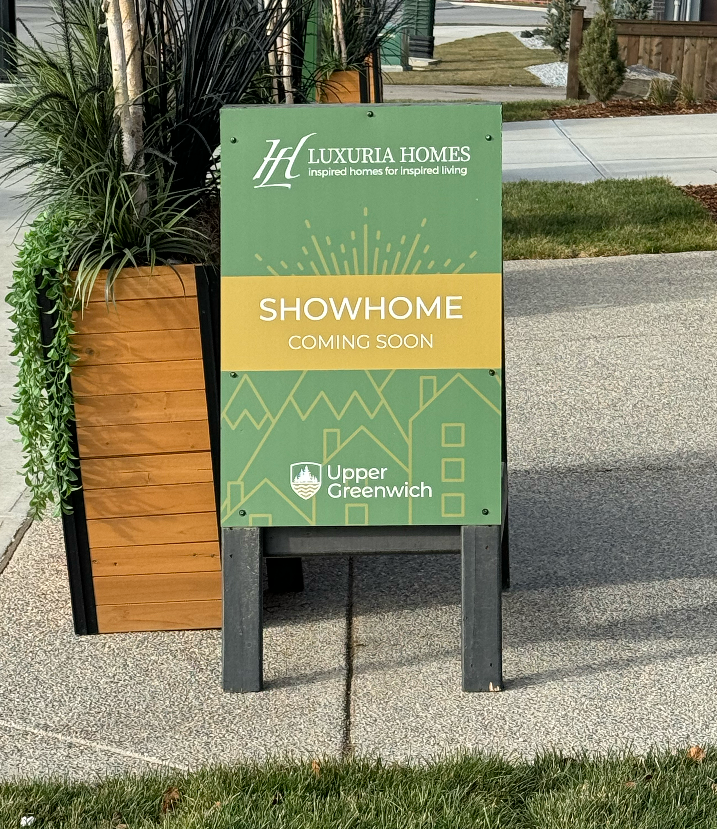
Greenwich Directional Signage
Exterior Signage Design and Mapping
I made a series of signage for a new housing development with background illustrations, each drawn from an existing style of iconography, that visually represent different aspects of the development.
One illustration showcases various housing types within the community, another highlights nearby amenities, a third shows the outdoor elements, and the fourth is a general representation of the Upper Greenwich development, including housing, outdoor features, and its mountain proximity. Each illustration incorporates a sun graphic in the background, ensuring a unified visual across all materials. The backgrounds, middle grounds, and foregrounds of each illustration are designed with consistent angles to create a consistent look. The colour palette of gold and green, paired with the detailed illustrations, adds subtle texture to the signage, providing an elevated look that reflects the high-end nature of the development.
Crests were added to the top of the monument signs and directional signage as an elevated branded element of the community. QR codes are placed on the signs as visitors are leaving for easy access to additional details and contact information for the sales teams. Mini signs were placed to guide visitors to virtual tours of homes, allowing them to explore floor plans and layouts when the homes are not open for viewing.


