Tradewinds Consulting Website
December 2023
Role: UX/UI Designer (User Research, Interaction, Visual Design, Prototyping, and Testing)
The Client:
The Tradewinds Group, comprised of experts in business consulting and financial planning, is dedicated to helping small businesses ($1 to $5 million/year) succeed beyond the 5, 10, and 20-year marks. By offering a holistic approach, they empower owners to achieve work-life balance and eventual successful company sales, aiming to break the cycle of small business failures.
The Goal:
Tradewinds faced the challenge of conveying their experience and support to clients in a professional manner. They seeked to represent themselves as a guiding force, akin to a steadfast star and a supportive wind. The goal was to empathize with business owners, articulate programs, encourage users to contact them, and maintain a polished website appearance while keeping a nautical, illustrative theme.
Research and Planning:
We initiated by surveying our target users to understand the websites that dominate their screen time. What are their preferred websites, and what features do they appreciate the most on these platforms? Which websites do they primarily use for work and to find tools that enhance their business? The information gathered from our research enabled us to develop three personas and user flows, each representing a distinct archetype within our target user group.
The Solution:
A site map was developed and we proposed content recommendations to assist the client in generating tailored website content aligned with the identified personas and user flows.
I then quickly sketched ideas for the pages using my research from the personas and user flows.
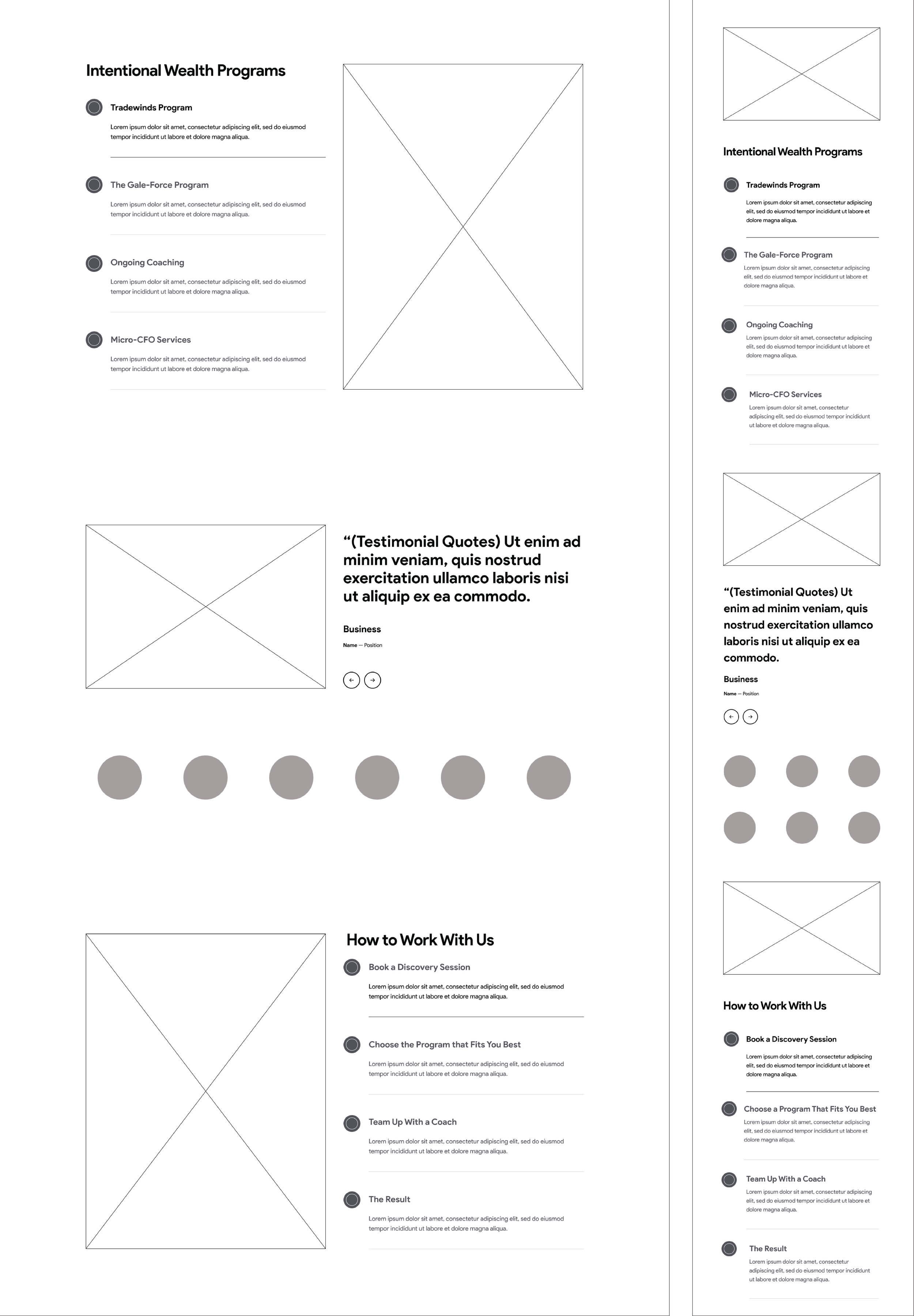
I created preliminary wireframes in Figma to get input from the client, developer, and users regarding the overall page layout and structure. This process entailed establishing a standardized visual hierarchy and layout.
Conducting usability testing was the next step to validate the effectiveness of the designs. A scripted scenario was made, prompting users to seek information on financial planning services and reach out to the company.
The Design Development:
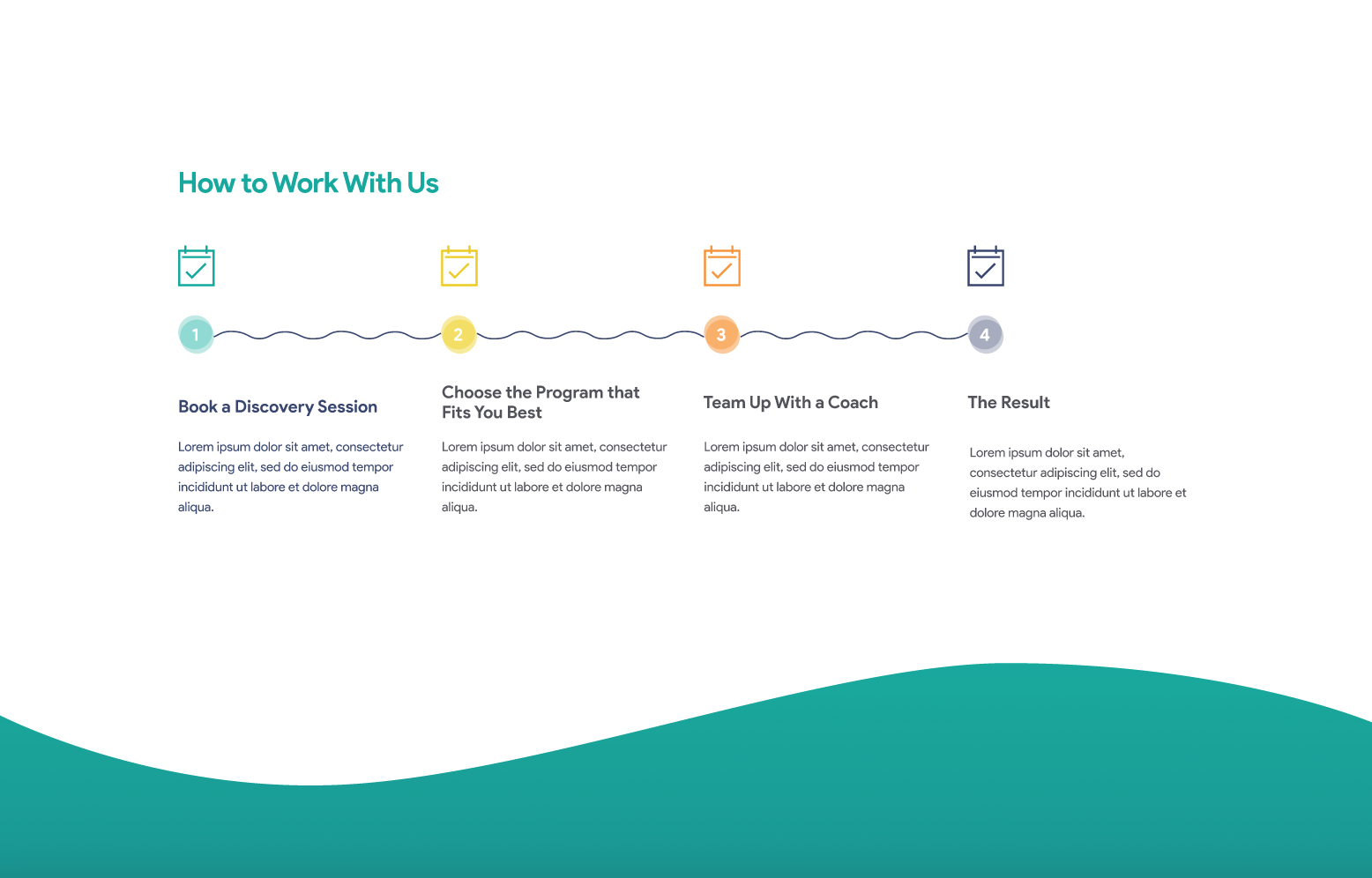
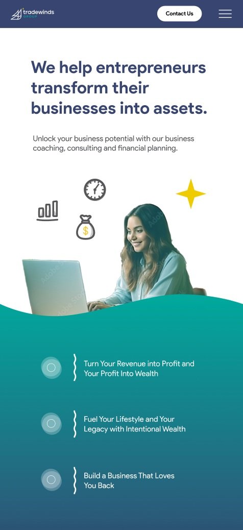
I created high-fidelity mockups using Figma for the developer and client to review. For the UI design, I used wave shapes as line dividers to give the site a subtle nautical theme, as well as background gradient wave shapes similar to the water in the ocean getting darker as it gets deeper. I used differing opacity in overlapping circles as the background shapes for icons to look like underwater bubbles. I also mixed photographs with illustrations so that the drawings had a more realistic and professional feel.
Collaborating with the developer, we outlined any additional interactions not addressed in the high-fidelity mockups. I am conducting a thorough review of all pages to ensure they adhered to the specified designs prior to the website going live.
Conclusion:
The website is still in development, but the testing has shown positive results for users reaching out to the company for their services. Moreover, we have received positive feedback from the client regarding the website's professional appearance, seamlessly blended with a nautical theme.
Key Takeaways gained from this project include:
Engaging with engineering early in the process proves invaluable. This proactive involvement minimizes the need for subsequent rework, as an upfront understanding of technical limitations informs a more strategic design approach.
User testing is an ongoing process beyond development, emphasizing the continuous iteration of design to enhance the end-user experience. Actively seek and consider user feedback consistently.


