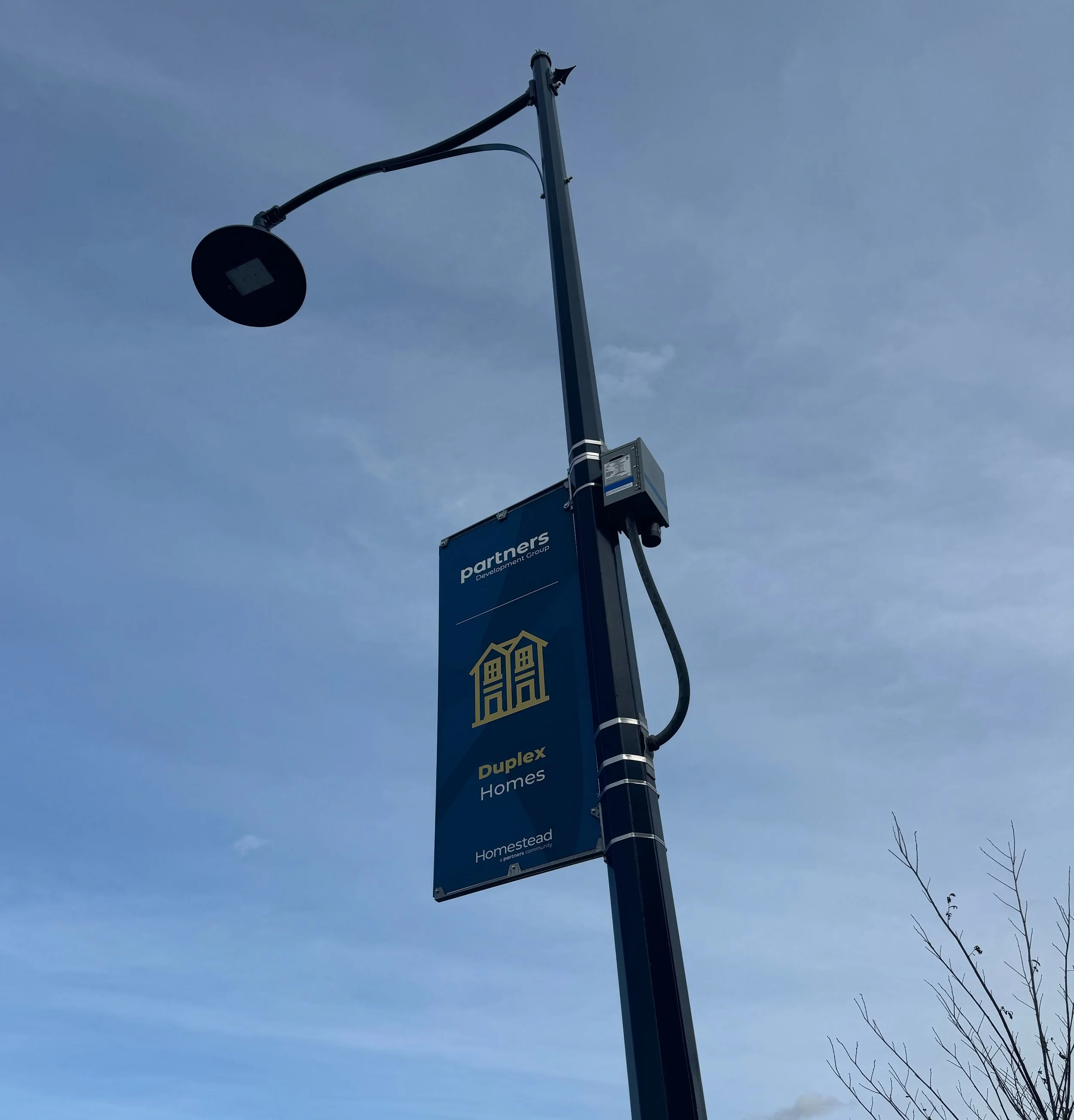
Homestead Community Signage
My Role: Mapped and created all signage
I designed directional signage for a housing development to guide visitors to the new showhomes. The signage needed to align with the existing branding while addressing the practical challenges of the construction site. Since temporary signage was frequently moved due to ongoing construction, light post banners were chosen as a solution that wouldn’t obstruct the work being done.
The directional flags featured orange backgrounds for logo flags and blue backgrounds for directional flags at decision points before key intersections, so that visitors know to look to blue flags for direction. To further assist with navigation, each showhome type was assigned a specific icon and color. Visitors could follow these icons and colors to locate the specific home type they were interested in.
Monument signs were placed at the entrance of each showhome to clearly mark the arrival point. The flags and monument signs incorporated elements from the logo’s wheat shape, rearranged into a pattern, adding branded detail to the signage. QR codes were placed on the signs as visitors are leaving for easy access to additional details and contact information for the sales teams. Mini signs were placed to guide visitors to virtual tours of homes, allowing them to explore floor plans and layouts when the homes are not open for viewing.


