Lawrie Park Condo Wayfinding
My Role: Mapped and designed all signage
For this project, I made signage to help visitors find the show suites in a new condo building, as well as made fire escape maps. I used colour-coding to make sure viewers could easily find where they needed to go, and didn’t enter into restricted spaces.
Show Suite Wayfinding:
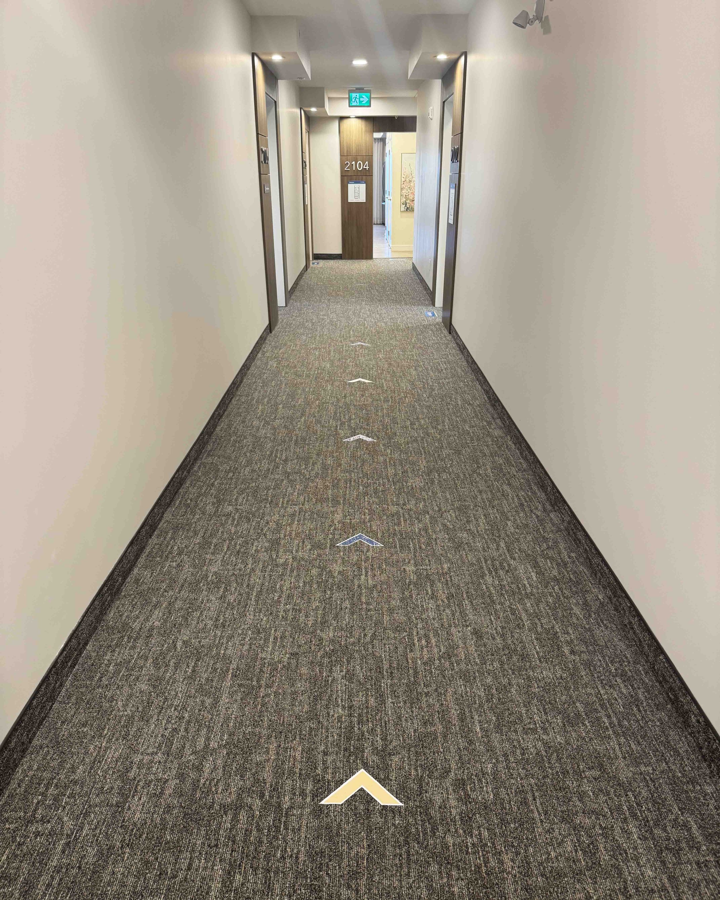
Lawrie Park is a new condo complex with five show suites. The Sales team wanted to make sure visitors could guide themselves from the Sales Office to the show suites if they were busy with other customers. At the back exit of the Sales Office, I made maps of the show suite locations so that visitors were aware there was more down the hallway. I put floor stickers indicating the direction of the suites at the exit, as well as arrow stickers on the floor to guide visitors to the additional suites. To make sure visitors knew that these were suites they could walk into (not private residences), I put floor stickers and aluminum composite wallboards at the door of each suite indicating the floor plan name, as well as more information about the unit such as square footage and bedroom/bathroom numbers.
I gave each floor plan type a colour, and used this colour wherever each unit type was displayed so that viewers knew to look for the colour corresponding to the unit types they liked when taking brochures and documents. I also used the unit colours on the floor arrows on the way to different show suites, so that visitors could follow the arrow colour of the show suite they were looking for.
To make sure visitors didn’t try to go into private residences, I put a sign at the door of the private units in grey so that they wouldn’t stand out.
Fire Escape Maps:
The condo’s Construction team needed fire escape maps on all floors of the buildings. I mapped out which wall space each map would be placed on, and oriented all maps in the direction that the viewers would be facing so that there wouldn’t be any confusion in the case of an emergency. The hallways are highlighted so that viewers could easily ignore other unnecessary grey information in a rush. I created easily recognizable icons: fire-related icons are all red, exit-related arrows and icons are green, electrical icons are yellow, and gas/water are blue. I made a system for the hierarchy of information so that all signage had a consistent feel on different sizes and types of maps.


