The Vintage Brand & Brochure
My Role: Conceptualized and produced all branding, designed an editorial-style brochure
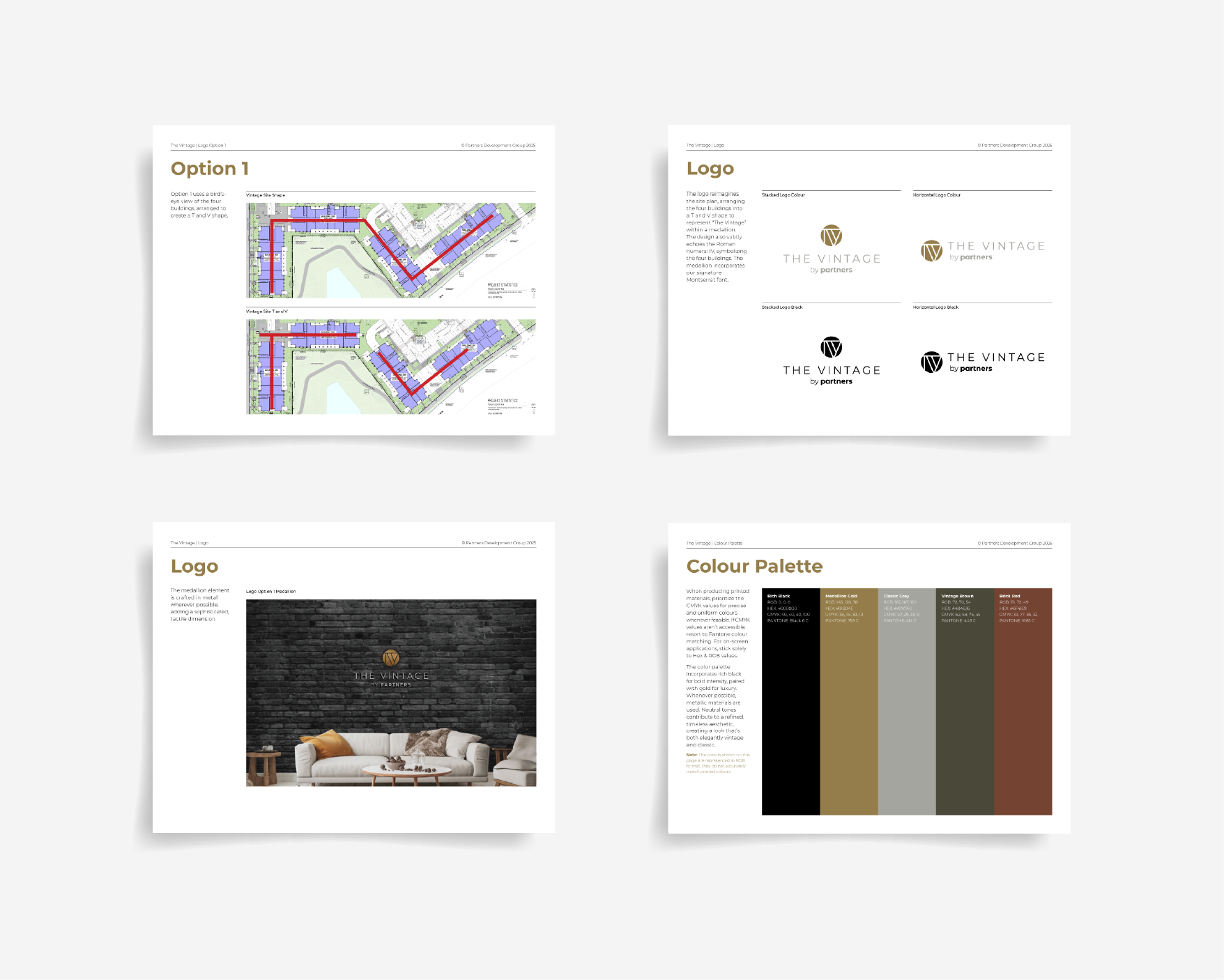
For this project, I developed the branding and a brochure for The Vintage, a new condo project in Calgary. The project needed to reflect the elevated feel of premium materials used in the building such as bricks in its architecture.
Brand:
The logo reimagines the condo complex’s site plan, arranging the four buildings into a T and V shape to represent “The Vintage” within a medallion. The design also subtly echoes the Roman numeral IV, symbolizing the four buildings in the complex. The typography is the Montserrat font used in all of the company’s branding, but with extended tracking between the letters for a more elevated feel.
Brochure:
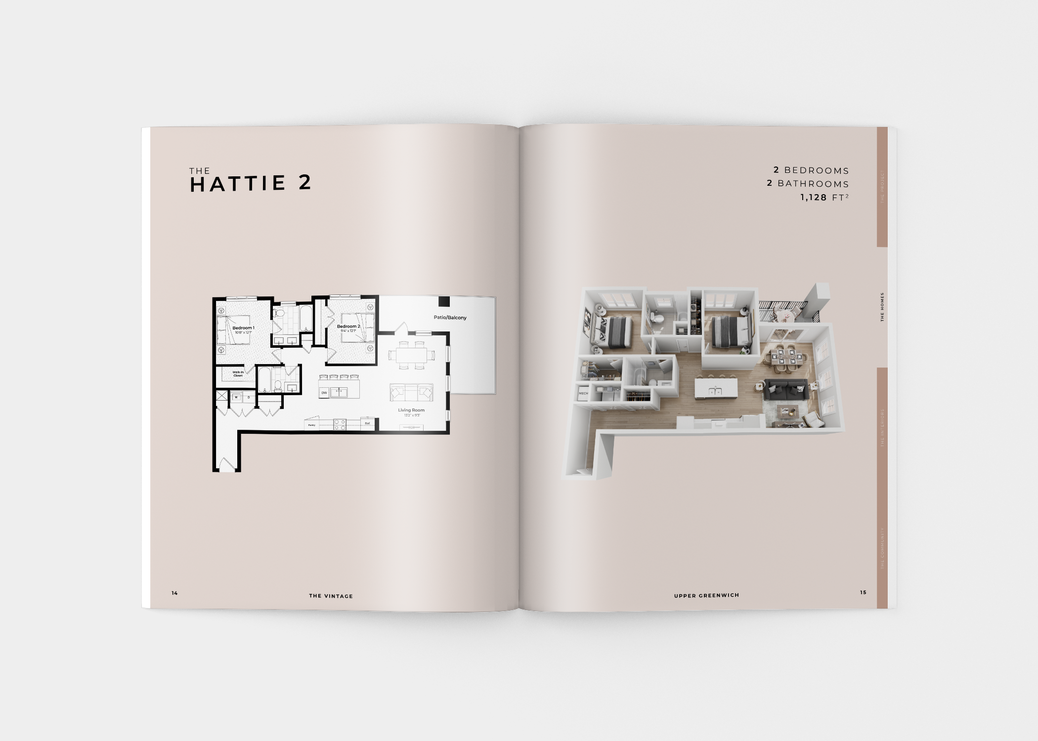
The images are arranged in brick masonry formations to represent the brick arches on the condo’s exteriors. The layout is similar to an editorial fashion magazine to reflect the condo’s premium finishes. Below is a selection of pages from the brochure.


