Keystone Creek Branding
My Role: Conceptualized and produced all branding
For this project, I developed the brand guide for Keystone Creek, a new housing community in Calgary. The developers had an existing idea for a logo that illustrated a keystone shape, and a pre-selected font. My role was to refine and expand upon this idea, creating a complete visual identity for the development.
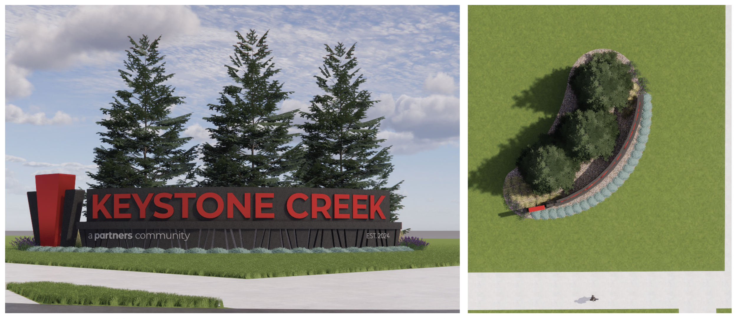
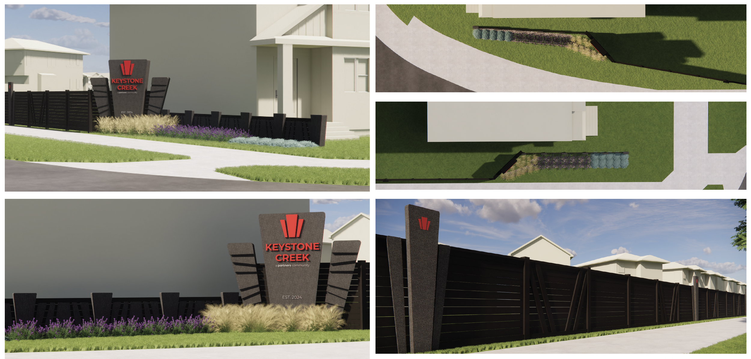
The brand concept centres around the symbolic strength of the keystone, paired with imagery that evokes family and community. The keystone, highlighted in red, serves as the central element of the logo, representing the foundation and stability of the development. Geometric shapes were used throughout the branding to reinforce the keystone's architectural structure, symbolizing both strength and unity.
To emphasize the sense of connection and togetherness, the brand elements incorporate an archway, symbolizing how the community brings people together and holds everything in place. Bold colors are used to create a striking, recognizable identity for the development that can be easily seen when driving by, while secondary colours reflect the natural beauty of the surrounding environment.
The keystone graphic is versatile, allowing it to be resized or cropped for use in various brand materials, such as images, billboards, and advertisements. It functions not only as the logo but also as a brand accent, adding consistency across all touchpoints.


